← All projectsHOSPITALITY / BRAND IDENTITY

An osteria.
A bold character.
OSTERIA MIOLA × GIRAFFA STUDIOLOGOTYPE / COLOUR / VISUAL IDENTITY
The project ↓01 / VISUAL IDENTITYStrong geometry.
Strong geometry.
Warmth in colour.
We designed Osteria Miola’s visual identity: a logotype built from bold shapes, a palette led by burgundy and a typographic system set out in the brand manual. A distinctive character for materials and spaces.
THE LOGOTYPE01—A

BOLD SHAPES. SHARP CUTS.IMPETUS HEAVY
BORDEAUX
WHITE
BLACK
TYPOGRAPHIC SYSTEMImpetus Heavy / Oswald / Kohinoor Bangla
02 / APPLICATIONSThe mark.
The mark.
Beyond the page.
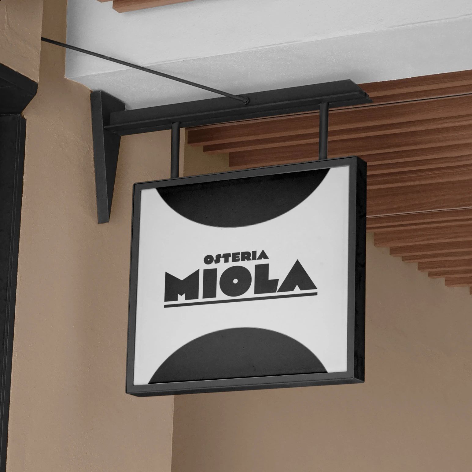
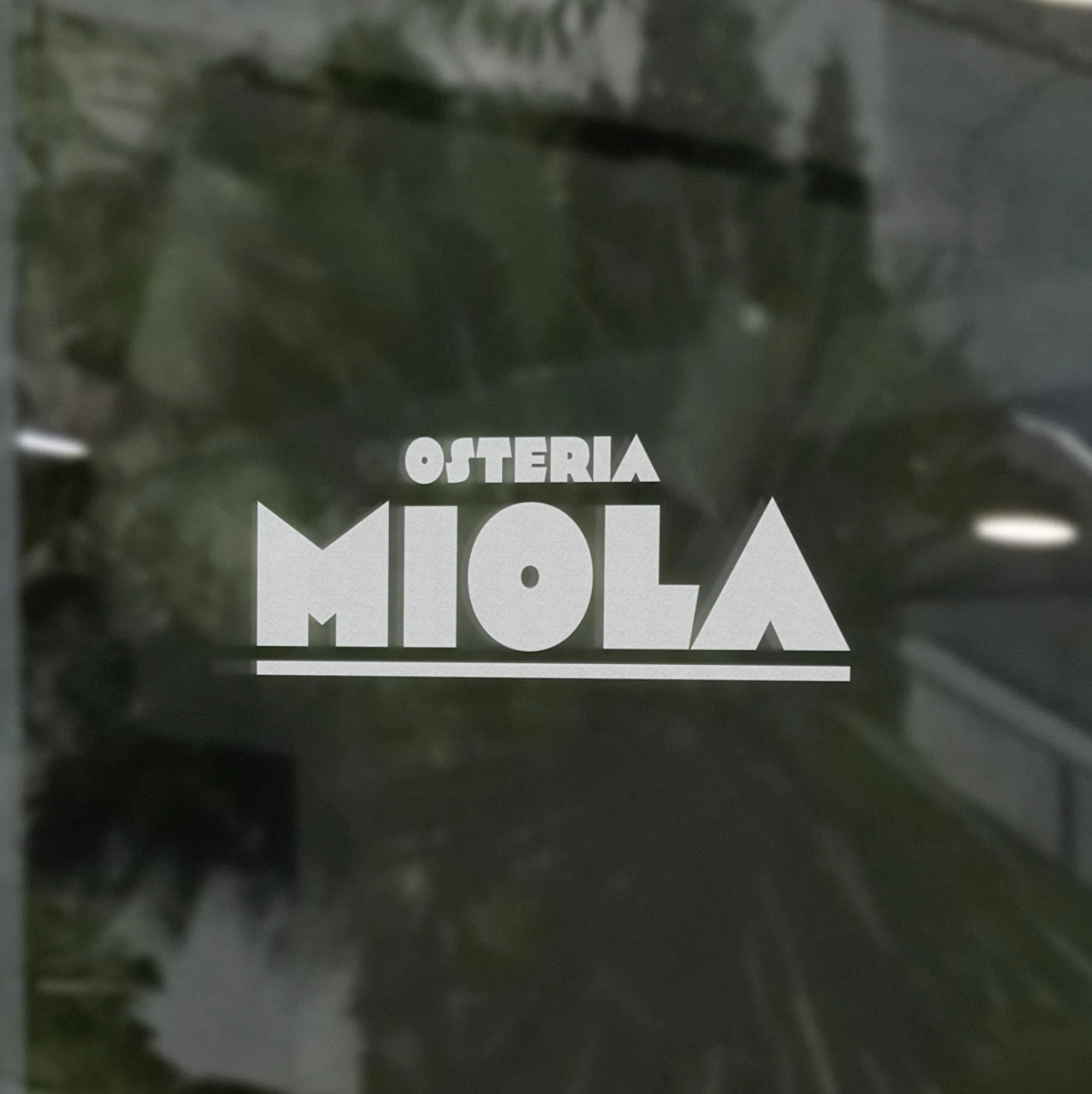
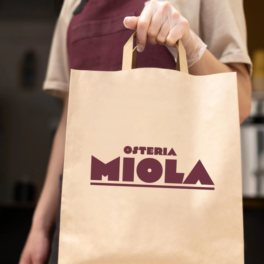
Signage, window graphics and a paper bag: three applications of the identity, shown through mockups from the brand manual.