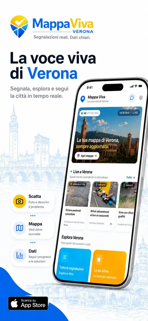
01
Capture.
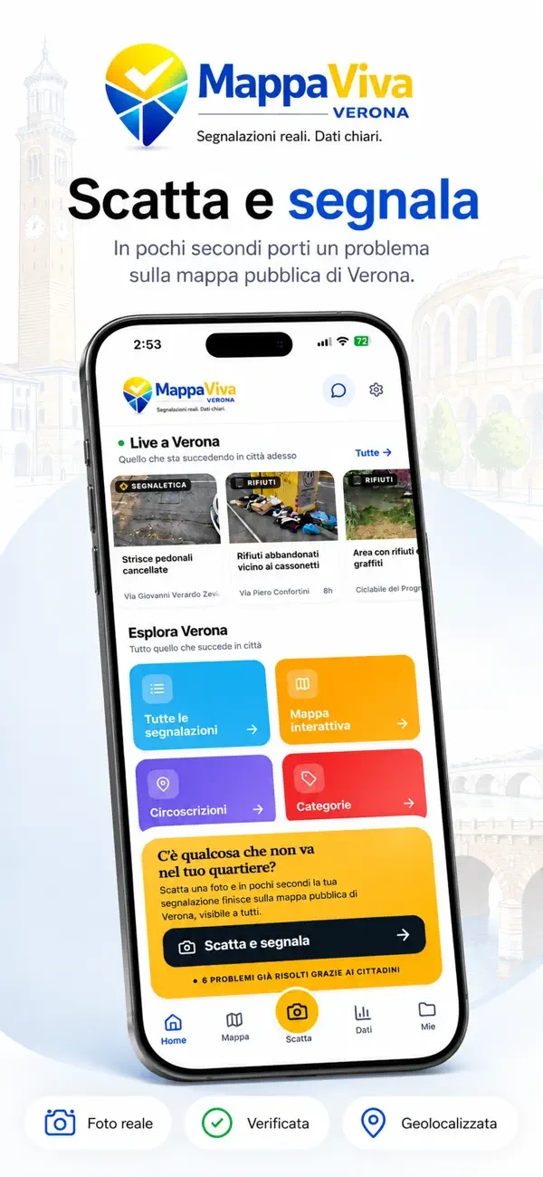
Give the issue a clear form.
Photo, location and details in a guided journey. The interface supports the report, step by step.

Independent minds.
Shared direction.
Verona.
The city, seen together.
We created Mappa Viva’s identity: its logo, colours and visual language. The location pin meets the check mark, connecting a place with the idea of action.
 REAL REPORTS. CLEAR DATA.
We designed and developed the website: a starting point for reports, the map and public data. The same identity runs through every step.
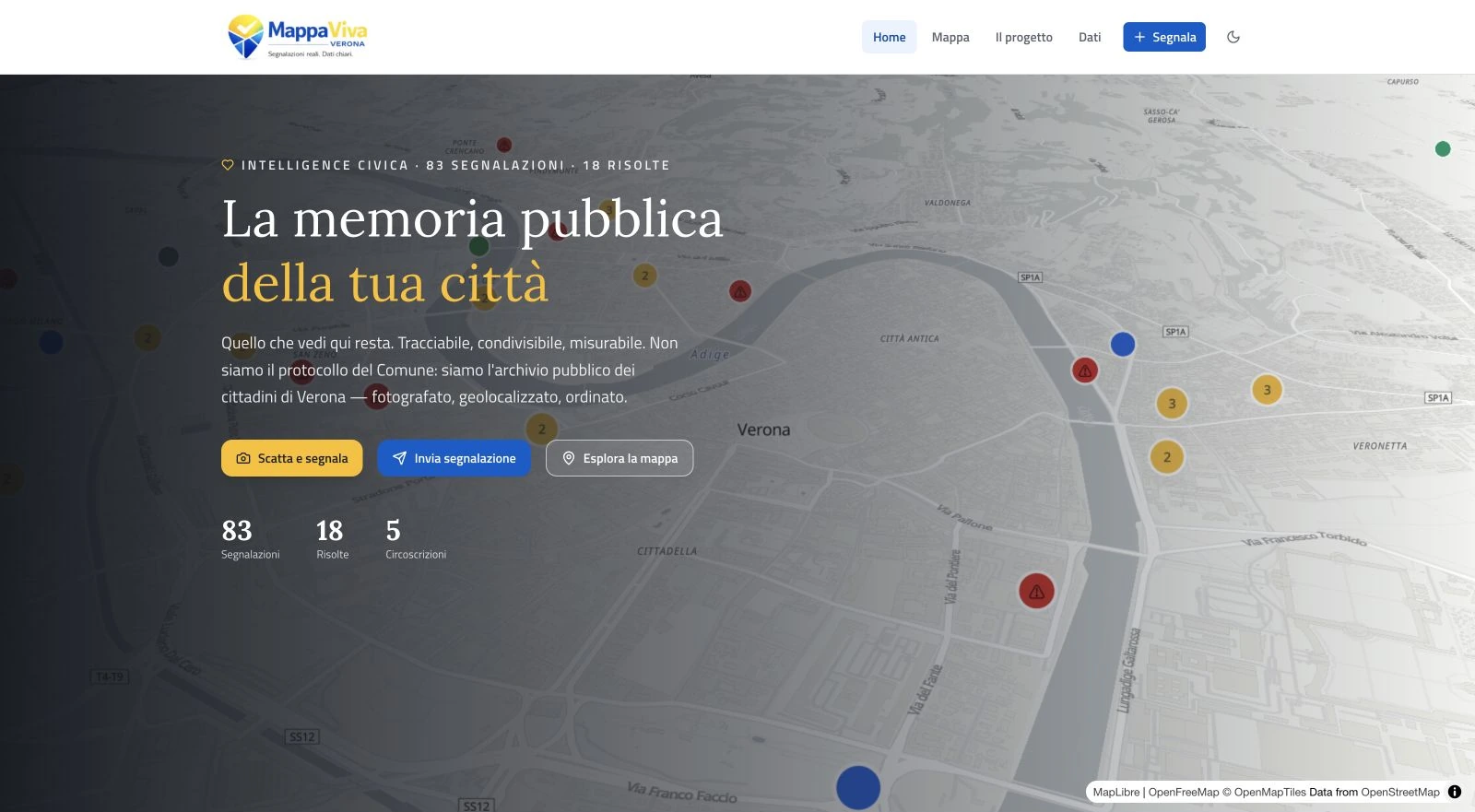
Categories, filters, 3D views. We shaped an interface that puts places at its centre.
Open the map ↗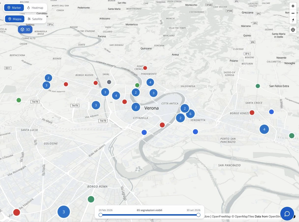
An independent civic project.
A shared perspective on the city.
Experience design and development of the iOS and Android apps. A clear journey to document an issue, find it on the map and follow its status.
Swipe through the three steps ↔
Photo, location and details in a guided journey. The interface supports the report, step by step.
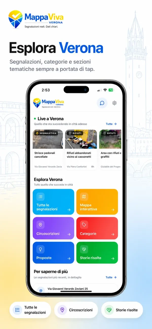
The map brings reports together. Categories, filters and views help people navigate places and issues.
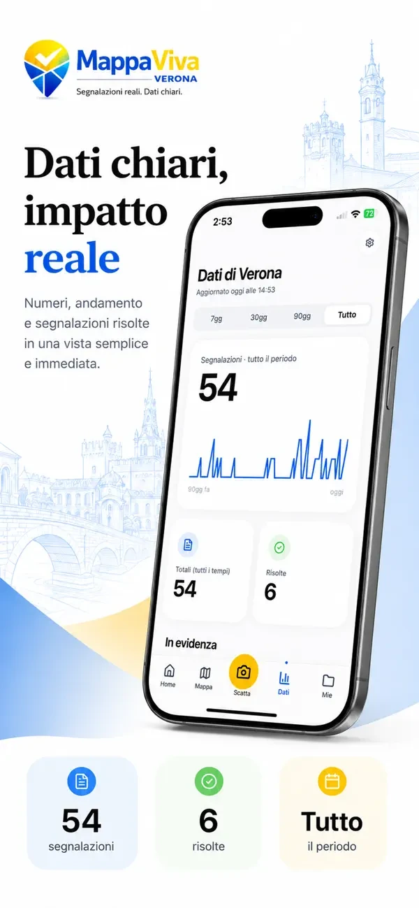
Statuses, categories and charts provide a shared view of reports and their progress.
App presentation visuals. The screens and values shown illustrate the interface, not project outcomes.
View on the App Store ↗From identity to product, we handled design and technical delivery. Website and apps belong to the same experience: recognisable, consistent and built around people.
Brand and visual language
Website design and development
App experience and development
App experience and development