← All projectsBRAND IDENTITY / WEB
Sports Center
Verona
An identity connecting
sport, wellbeing and club life.
BRAND IDENTITY / WEB DESIGN
Wellbeing.
In motion.
01 / BRAND IDENTITYMany activities.
Many activities.
One identity.
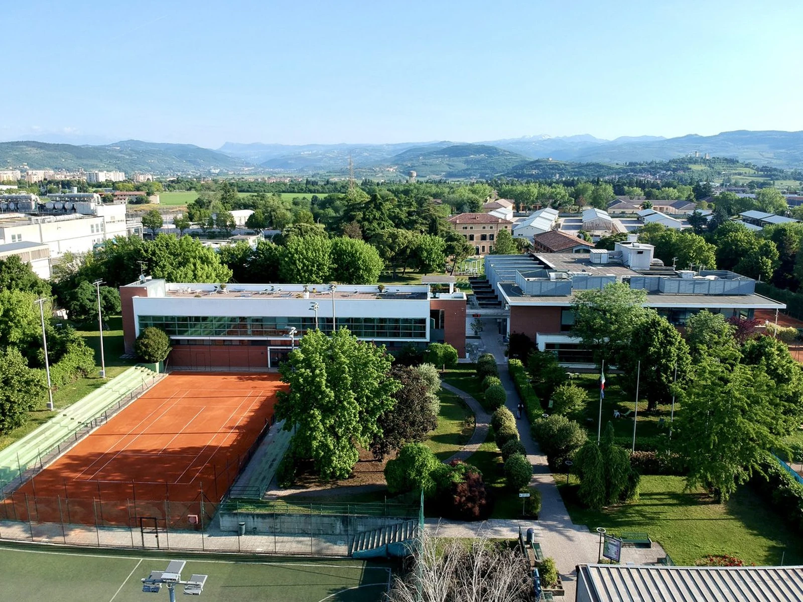
We developed Sports Center Verona’s visual identity and website. The logo, colours and typography create a shared language for the centre’s different activities.
THE SYMBOL SPORTS CENTER VERONA
TYPOGRAPHY / BARLOW
Wellbeing
in motion.
Aa Bb Cc0123456789
Deep Wellness#123E3A
Fresh Mist#CFE1DC
Paper#F7F4EE
SCV Orange#D7821B
02 / IDENTITY IN USEFrom system.
From system.
To print.
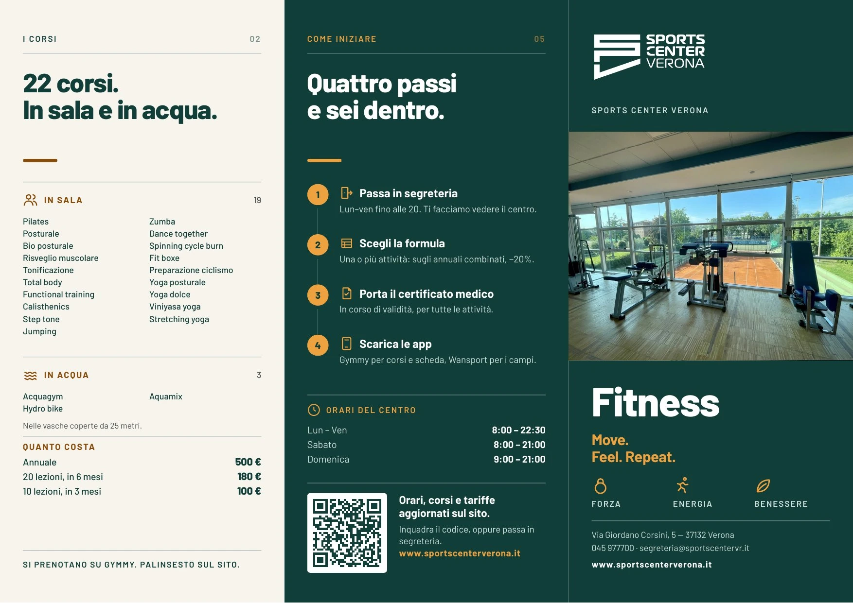
The same choices become practical materials: clear hierarchy, images of the centre and organised information. Shown here: the Fitness brochure for the 2026/27 season.
03 / WEB DESIGN & DEVELOPMENTThe whole centre.
The whole centre.
Within reach.
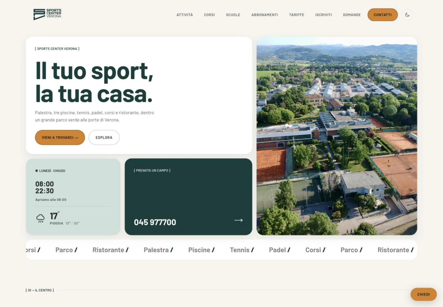
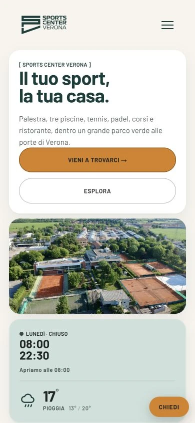
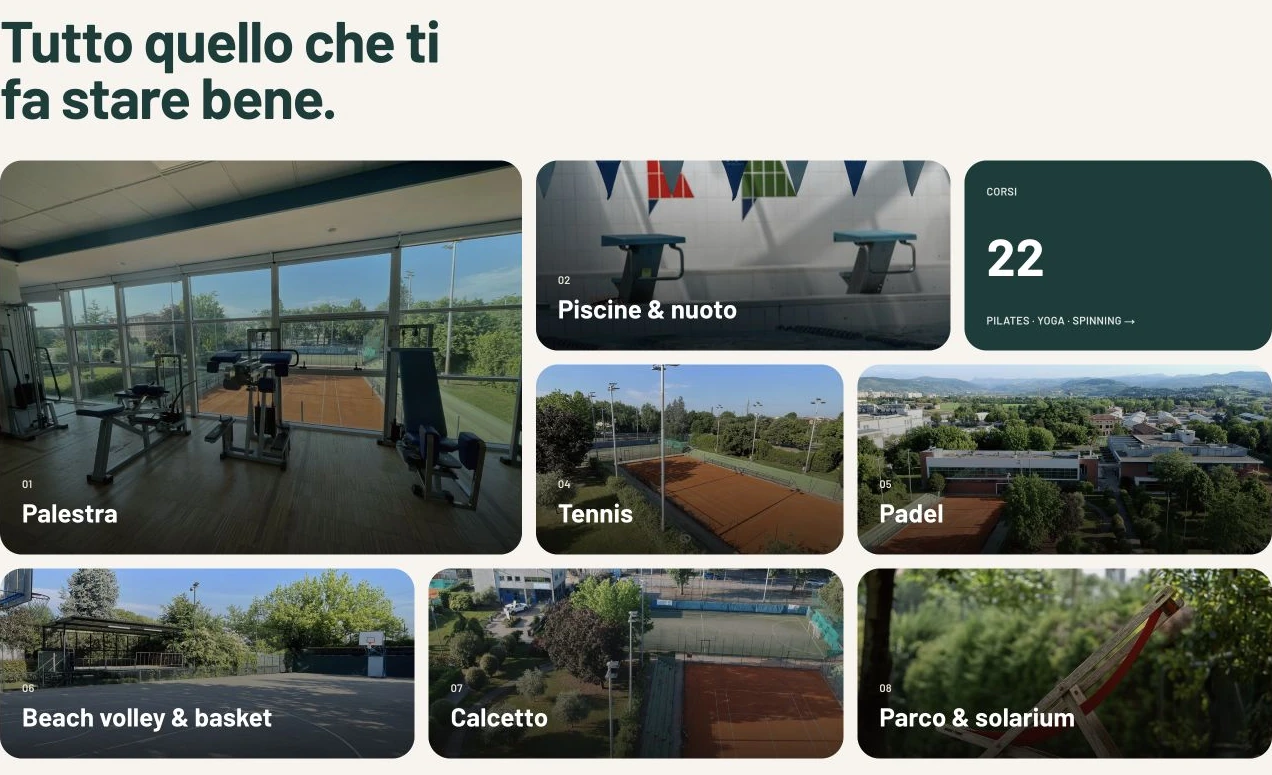
We designed and built the website, giving activities, classes and practical information a shared structure. The visual identity carries through the experience, from desktop to phone.